
The QR Code Killed the Menu. Nobody Noticed.
Most Indian restaurants replaced their menus with PDFs behind a QR code — and quietly threw away menu engineering, hierarchy, and hundreds of years of design work.
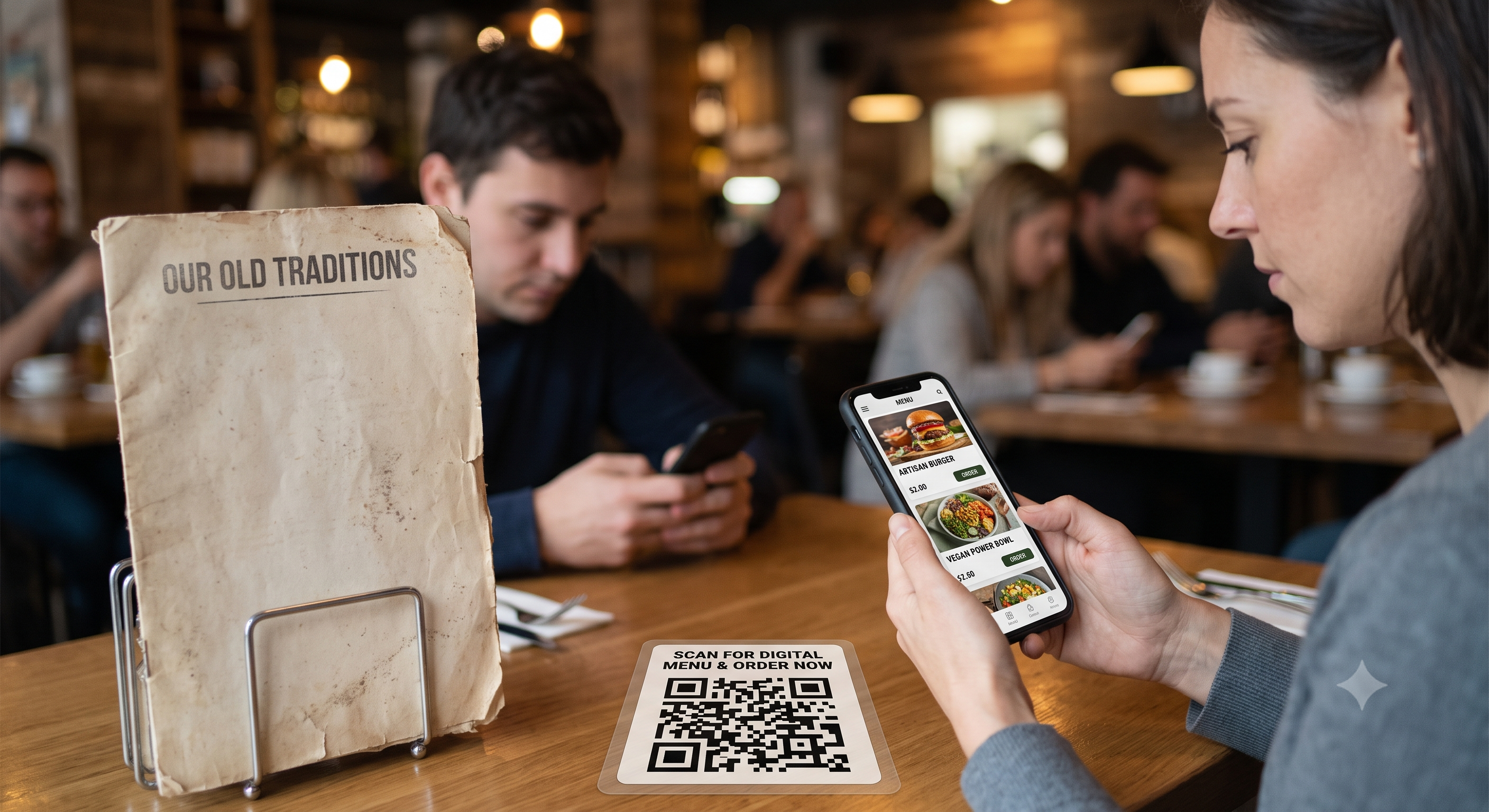
Walk into almost any restaurant in India today — a fine-dine in Jubilee Hills, a biryani joint in Tolichowki, a café in Bandra, a dhaba on the Mumbai-Pune expressway — and the first thing that lands on your table is not a menu. It's a laminated card with a QR code, sometimes stuck to the table with cellotape, sometimes wedged into a plastic tent alongside the salt shaker.
The pandemic gave restaurants a good reason to go contactless. The economics kept them there. A printed menu costs ₹200–800 a copy, gets sticky, gets torn, and becomes obsolete the moment tomato prices spike or the paneer supplier changes. A digital menu updates in thirty seconds and costs nothing to reprint.
So the switch made sense. What didn't make sense was what most restaurants switched to.
Most QR menus are not menus. They're PDFs.
Here is the standard implementation: the restaurant sends the print-ready PDF from its designer to a QR generator, gets a code, prints the code, and considers the project done.
The result is a document designed for an A3 sheet of paper being delivered on a 6-inch screen. The customer pinches. Zooms. Drags left. Loses their place. Zooms out to find the Tandoor section. Zooms in again. Somewhere around the third scroll they give up and ask the server, "Bhaiya, aap hi bata dijiye — kya achha hai?"
That question is the sound of a restaurant's menu strategy collapsing.
Problem one: nobody can read it
A print menu is read at arm's length under decent light on paper that doesn't glare. A phone menu is read in conditions the designer never tested for:
- Dim, moody lighting. Ambient restaurant lighting is deliberately low. Phones auto-dim in warm light or the diner has already dimmed the screen to save battery.
- 8pt type that was never meant to be 8pt. A PDF zoomed to fit a phone screen renders body text at a size that's borderline on a laptop and impossible on a handset.
- Reading glasses. This is the one restaurants forget entirely. A large share of diners over 40 need correction for near vision, and the person who used to hold a printed menu a little further away can't do that with a zoomed PDF without losing the whole layout. Anyone who left their glasses in the car is now excluded from their own dinner decision.
- Grandparents at the table. Indian restaurant dining is multi-generational and group-oriented. A table of eight passing one phone around, taking turns squinting, is not a dining experience. It's a queue.
- Patchy data. Basement restaurants, mall food courts, hill-station properties, and the third floor of any building in an Indian metro all have unreliable signal. If the menu is a 14 MB PDF with uncompressed food photography, it doesn't load. If it needs an app install or an OTP login before showing a single dish, it doesn't get opened at all.
Problem two: the chef's best work disappears
Open a well-made printed menu and your eye goes somewhere specific. The signature dish sits in a box. The chef's special has a small illustration and a line of copy about the fourteen-hour slow cook. The house biryani has a "Must Try" flag next to it. Someone made deliberate decisions about what you see first.
Now flatten that into a vertical scroll on a phone. The box is still there, technically — but you'll reach it after 40 seconds of scrolling, at which point it's just another rectangle among rectangles. There is no top of the page anymore. There is no "page" at all. Every dish has become equally prominent, which is another way of saying none of them are.
The specials board suffers worst. Seasonal items, today's catch, the limited-run mango dessert in May — these are the highest-margin, highest-delight items on any menu, and in most QR implementations they're either absent (because the PDF wasn't re-exported) or buried in a section nobody scrolls to.
Problem three: menu engineering silently dies
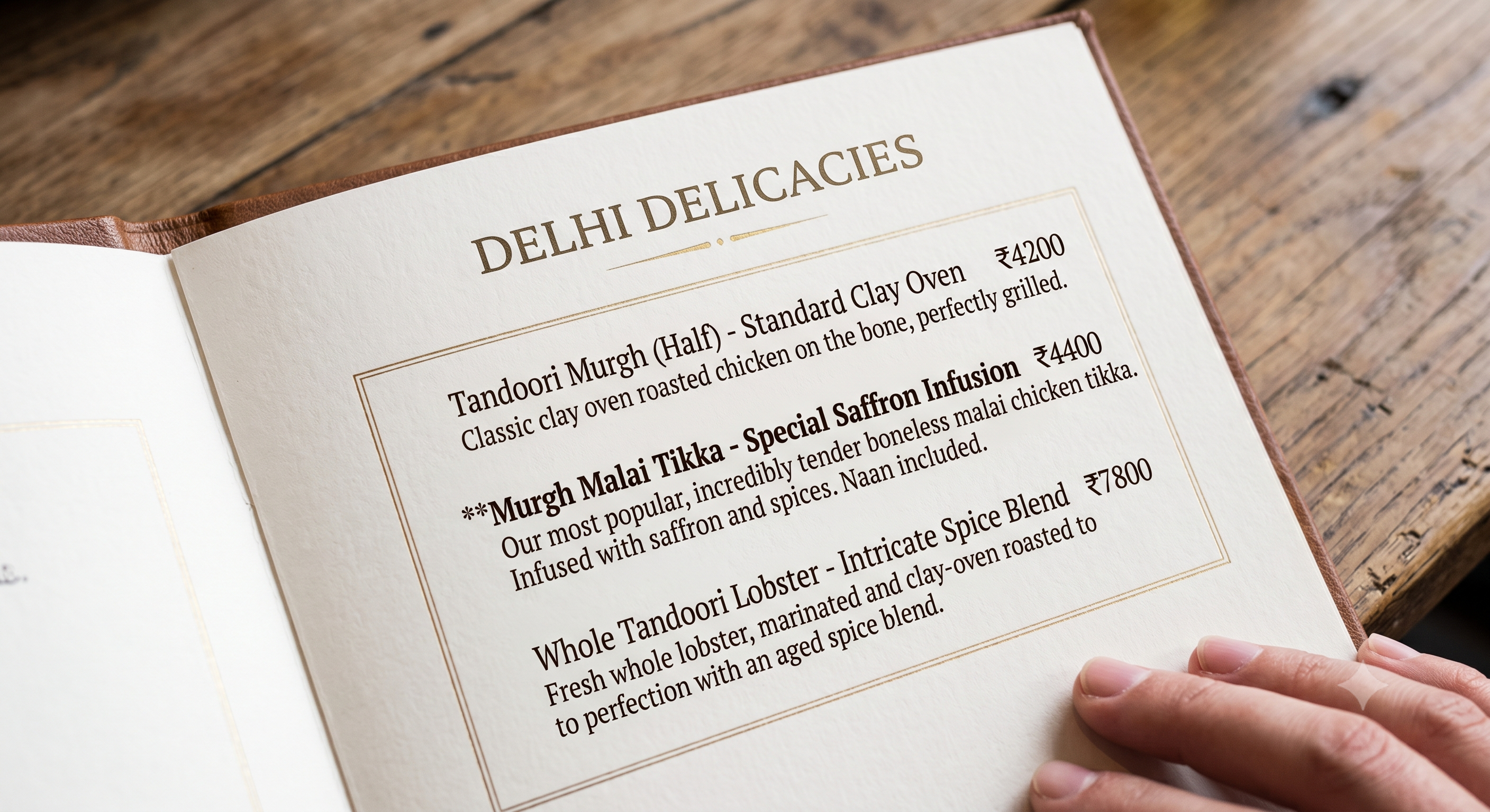
Printed menus are among the most quietly manipulative documents in commerce, and that isn't a criticism — good menu design helps diners find what they'll actually enjoy while helping the restaurant stay solvent. Decades of technique go into it, and almost all of it depends on layout and hierarchy. Which is exactly what a phone scroll destroys.
Anchoring. Put a ₹1,850 Lobster Moilee at the top of the seafood section and the ₹680 Fish Curry that follows reads as sensible, even generous. Remove the anchor — or worse, sort the section low-to-high, which most digital menus do by default — and the ₹680 dish becomes the most expensive thing in view. Diners now anchor to your cheapest item. Every price above it feels like an upsell.
Sorting is the most common and most expensive mistake in digital menus. Ascending price order feels helpful, looks tidy, and systematically pushes the table toward the bottom of your margin range.
The decoy. A slightly overpriced middle option exists to make the option next to it look like the smart choice. It only works if both are visible at the same time. On a phone, they're separated by a scroll.
Visual hierarchy and framing. Boxes, whitespace, a different typeface, a photograph — these tell the reader "this one." Digital menus either apply photos to everything, which flattens hierarchy just as effectively as applying them to nothing, or apply them to nothing at all.
Descriptive copy. "Kolhapuri Mutton — ₹640" sells one way. "Kolhapuri Mutton — goat shoulder, dry-roasted coconut and byadgi masala, slow-cooked the way it's done in Kolhapur's khanavals — ₹640" sells another. Compressed digital templates tend to truncate descriptions to one line, or drop them for space.
Choice architecture. Indian menus are famously enormous — 200-plus items spanning North Indian, Chinese, Tandoor, Continental, and biryani, because everyone at a family table must be accommodated. Print at least gives you sections you can take in at a glance. An endless scroll with no search, no category chips, and no filters turns a long menu into decision fatigue, and decision fatigue produces the safest possible order: dal makhani, butter naan, done. Nobody tries the new dish. Nobody orders dessert.
What this actually costs
Lower average order value, because impulse items — desserts, mocktails, starters, that one indulgent add-on — live or die on visibility. Slower table turns, because ordering takes longer. More load on your servers, who now recite the menu verbally. Fewer trials of new dishes, so the kitchen's creative work goes unseen and eventually stops being attempted. And a first impression, before any food arrives, of friction.
What a good digital menu looks like
The fix isn't going back to paper. It's building for the screen the menu actually appears on.
- Build a mobile-first web page, not a PDF. No pinching, no zooming, no horizontal scroll. Reflowing text that respects the phone's own font-size setting — so the diner who has already set their system text large gets it large.
- 16px minimum body text, high contrast, dark-mode aware. Test it in your own restaurant, at your own lighting level, on a five-year-old budget Android at 40% brightness. That's your real device.
- Under two seconds to first useful content on a 3G connection. Compressed images, lazy loading, no framework bloat.
- No login, no OTP, no app install, no phone-number capture before the food is visible. Collect data later, after you've earned it.
- A hero section. Four to six signature and seasonal dishes at the very top, with photographs and real copy. This replaces the boxed special of the printed menu, and it's the single highest-return change available.
- Badges that mean something: Bestseller, Chef's Special, New, Jain available, and a clear spice indicator. Veg/non-veg markers must be unmissable — this is a non-negotiable in India and small green dots on a dim screen are not enough.
- Preserve anchoring. Never default to ascending price. Lead each section with the premium item, keep the intended order, and let the structure do its work.
- Photograph only the top 20% of items. Photos are a hierarchy tool. Spend them where you want attention.
- Search, sticky category navigation, and filters for menus over 60 items. If your menu is 200 items long, filters aren't a nicety, they're the only way through.
- Keep ten printed copies at the host desk. Offer one, unprompted, to anyone who looks like they'd prefer it. This costs almost nothing and is the difference between an inclusive restaurant and a tech-gated one.
- Then use the one advantage print never had: analytics. Which items get viewed and not ordered? Where do diners drop off? Which position in the section actually converts? Move things, measure, repeat. A printed menu is a guess you commit to for a year. A digital menu should be a system that gets smarter every month — and almost nobody is using it that way.
The QR code is a delivery mechanism, not a menu
That's the whole point. The code did its job the moment the page opened. Everything that matters after that — legibility, hierarchy, the chef's voice, the quiet architecture of anchoring and framing — is design work that somebody still has to do.
Most restaurants saved the printing cost and quietly threw away the menu.