
Restaurant Staff Efficiency Metrics: How to Read the Signals, Not Just the Numbers
How to measure restaurant staff efficiency — which metrics matter, how to get labour hours when staff are on monthly salaries, and how to read combinations of metrics as operational signals.

Quick answer: Staff efficiency cannot be read from one number. Measure four dimensions together — output, speed, quality and cost — and watch how they move relative to each other. Rising productivity alongside falling accuracy is not efficiency; it is an operation running too lean.
Measuring restaurant staff efficiency sounds simple.
You can calculate orders per labour hour, sales per labour hour, labour cost percentage, service time and a dozen other KPIs. But the difficult question is not "What is the number?"
It is:
**What is the number telling me about the operation?**
A restaurant can have high orders per labour hour and still have a staffing problem. It can have low labour cost and still be inefficient. It can cut service time while quietly increasing mistakes.
That is because staff efficiency is multidimensional. The useful approach is to read metrics together and look for signals.
The assumptions this article runs on
Rather than quoting figures from elsewhere, this article works from a single model restaurant. Every example below uses it, so the numbers stay consistent with each other.
Our reference restaurant
| Format | Independent casual dining, single outlet, Indian metro |
| Seats | 80 |
| Service | Lunch 4 hours, dinner 5 hours, seven days |
| Volume | Around 1,300 covers a week |
| Average spend | ₹400 per cover |
| Weekly revenue | Approximately ₹5.2 lakh |
| Workforce | Monthly-salaried, some staff living in, meals provided |
| Blended labour cost | Around ₹115 per labour hour, all-in |
| Labour cost | Around 20% of revenue |
| Food and beverage cost | Around 33% of revenue |
The seven assumptions underneath it
- The workforce is salaried, not hourly. Nobody clocks in. Hours have to be derived rather than read off a timesheet.
- Labour cost means total cost of employment — salaries, overtime, PF and ESI, staff meals, accommodation, uniforms, recruitment and training. Not just payroll.
- The cost ranges here are working ranges, not measured standards. They are the bands we see operators work to. No published study establishes them, and we would treat anyone who cites one with suspicion.
- RevPASH applies to dine-in only. Delivery and takeaway revenue have no seats behind them.
- Volume is high enough for percentages to mean something. At roughly 500 orders a week, a one-point accuracy move is about five orders. Small restaurants need longer periods, not tighter thresholds.
- Measurement is consistent rather than precise. A flawed method applied identically every week still reveals trends. A method that changes mid-quarter destroys the comparison.
- Comparisons are like-for-like. Lunch against lunch, Saturday against Saturday, this outlet against itself.
If your restaurant differs from this model — and most will — the section at the end explains which conclusions change and which hold.
The four dimensions
- Output — How much work is the team producing?
- Speed — How quickly is that work being completed?
- Quality — Is the work being done correctly?
- Cost — What is the business paying for that output?
These must be read together.
A staff member processing 30 orders an hour looks highly productive. If those orders carry a high error rate and guests are waiting longer, the productivity number is hiding a problem.
Equally, a restaurant that cuts labour cost from 20% to 15% looks more efficient. If service quality has fallen because the team is understaffed, the saving is being paid for elsewhere — in walkouts, in bad reviews, and eventually in staff who leave.
First, where do labour hours come from?
Almost every formula below divides by labour hours. That number is the foundation, and in most Indian restaurants it does not exist yet (assumption 1).
Pick a method and stay with it. In rough order of accuracy:
- POS login sessions. If captains, cashiers and kitchen staff log in under their own IDs, you already have first-login to last-action timestamps. Imperfect — it misses prep and cleaning — but consistent and free.
- A shift register. Rostered start and end times recorded daily by the supervisor. Less precise than a clock, far better than an estimate.
- Rostered hours. Scheduled hours multiplied by headcount. Use this only if you track absence and overtime separately, or it will quietly overstate your efficiency.
Then decide what goes into labour cost (assumption 2). Staff meals and accommodation are the items most often left out, and in an Indian restaurant they are a real and sometimes substantial part of what an employee costs. Leave them out and your labour cost percentage will look better than it is.
In our reference restaurant, a blended ₹115 per labour hour already includes them. Payroll alone would be nearer ₹90, and using that figure would understate labour cost by roughly a fifth.
The output metrics
Orders per labour hour
Orders per Labour Hour = Total Orders ÷ Total Labour Hours
Useful for comparing shifts, days, outlets and staffing levels against each other. Not a standalone measure of individual performance — a high number can mean excellent productivity or an overloaded team.
Sales per labour hour
Sales per Labour Hour = Net Sales ÷ Total Labour Hours
This adds a financial dimension. Two restaurants, both running 100 labour hours:
| Restaurant | Orders | Sales | Orders/Hour | Sales/Hour |
|---|---|---|---|---|
| A | 800 | ₹1,60,000 | 8.0 | ₹1,600 |
| B | 1,200 | ₹1,44,000 | 12.0 | ₹1,440 |
B processes more orders per labour hour. A generates more sales per labour hour.
Activity and value are not the same thing.
Covers per labour hour
Covers per Labour Hour = Covers Served ÷ Labour Hours
For dine-in restaurants with widely varying order values, this is often the more meaningful of the two.
A note on scale. Full-service and quick service live in completely different ranges here. Our reference restaurant runs around 1.4 covers per labour hour — roughly 1,300 covers against 950 labour hours in a week. A QSR counter might run ten times that. A number that would be alarming in one format is unremarkable in the other, which is why assumption 7 matters more than any benchmark.
RevPASH — the metric that prices time
Most restaurant metrics measure money or volume. Only one prices the thing you are actually selling, which is a seat for a period of time.
RevPASH = Net Revenue ÷ (Available Seats × Hours Open)
Our reference restaurant has 80 seats and a five-hour dinner service, so 400 available seat-hours. A ₹2,00,000 dinner gives a RevPASH of ₹500 per seat-hour.
This catches what turn rate misses. A room that fills completely at 8:30pm but sits at 40% occupancy from 6:30 to 8:00 has a respectable turn rate and a RevPASH that tells the truth. Those empty early-evening seats are revenue that cannot be recovered once the hour has passed.
Calculate it hour by hour across a service rather than as a daily average. It will usually show that your staffing problem is not a staffing level problem but a staffing timing problem.
Remember assumption 4: exclude delivery and takeaway revenue, or you will inflate the figure.
The speed metrics
Break service time into its links rather than measuring it end to end:
- Order-to-KOT time
- KOT-to-ready time
- Ready-to-serve time
- Order-to-serve time (the guest's experience)
- Table clearing, reset and turnaround time
Measuring the chain tells you where work is getting stuck. If order-to-KOT is 30 seconds and KOT-to-ready is 22 minutes, the captain is doing their job and the constraint is downstream.
A single end-to-end number tells you something is slow. The chain tells you what.
The quality metrics
Order Accuracy % = Correct Orders ÷ Total Orders × 100
Speed without accuracy is not efficiency, it is deferred cost. Supporting measures: wrong-item rate, KOT modification rate, remake rate, void rate, cancellation rate, complaint rate.
These are only meaningful alongside productivity. On their own they are a quality report; together they are a diagnosis.
The cost metrics
Labour cost percentage
Labour Cost % = Total Labour Cost ÷ Net Sales × 100
A falling figure can mean better scheduling, higher sales against the same team, or genuinely reduced overstaffing. It can equally mean understaffing, excessive workload, falling service quality and rising attrition.
**Lower labour cost is not automatically better.**
Labour cost per cover
Labour Cost per Cover = Total Labour Cost ÷ Covers
Useful for comparing shifts of different sizes. In our reference restaurant:
| Shift | Labour Cost | Covers | Cost/Cover |
|---|---|---|---|
| Lunch | ₹9,000 | 300 | ₹30 |
| Dinner | ₹14,000 | 700 | ₹20 |
Dinner costs more in total and uses labour more efficiently per guest.
Prime cost
Prime Cost % = (Food & Beverage Cost + Total Labour Cost) ÷ Net Sales × 100
Labour cost cannot be judged apart from food cost, because the two trade against each other constantly. Many ways of reducing labour increase food cost, and vice versa. Buying pre-cut vegetables, pre-portioned proteins or ready gravies cuts kitchen hours and raises food cost. Scratch preparation does the opposite.
Our reference restaurant sits at roughly 20% labour and 33% food, so a prime cost near 53%.
If your labour cost falls three points and your food cost rises four, you have not become more efficient. You have become more expensive while looking leaner. This is the single most common way a staffing decision gets judged wrongly.
The ranges we work to
These are the bands behind the reference restaurant. Read them as assumption 3: working ranges, not measured standards.
| Measure | Range we work to | Why |
|---|---|---|
| Labour cost | 18–30% of revenue | Indian wages are low relative to menu prices, so this sits well below what Western guidance suggests |
| Food and beverage cost | 28–35% | The one range that travels reasonably well |
| Prime cost | 55–60% for a well-run operation | The number that actually decides whether the business works |
| Rent and occupancy | 8–15%, ideally under 12% | Context for why labour runs lower here than elsewhere |
Two cautions. First, international benchmarks are materially higher on labour and lower on rent, because the underlying cost structures differ. Applying them to an Indian restaurant will make you conclude you have hiring headroom that you do not have, or a problem that you do not have.
Second, and more important: a benchmark is a sanity check, never a target. The only comparison that reliably means anything is your own restaurant against itself. If your labour cost has run at 24% for two years and the business is profitable, 24% is your number, whatever any range says.
The signal matrix
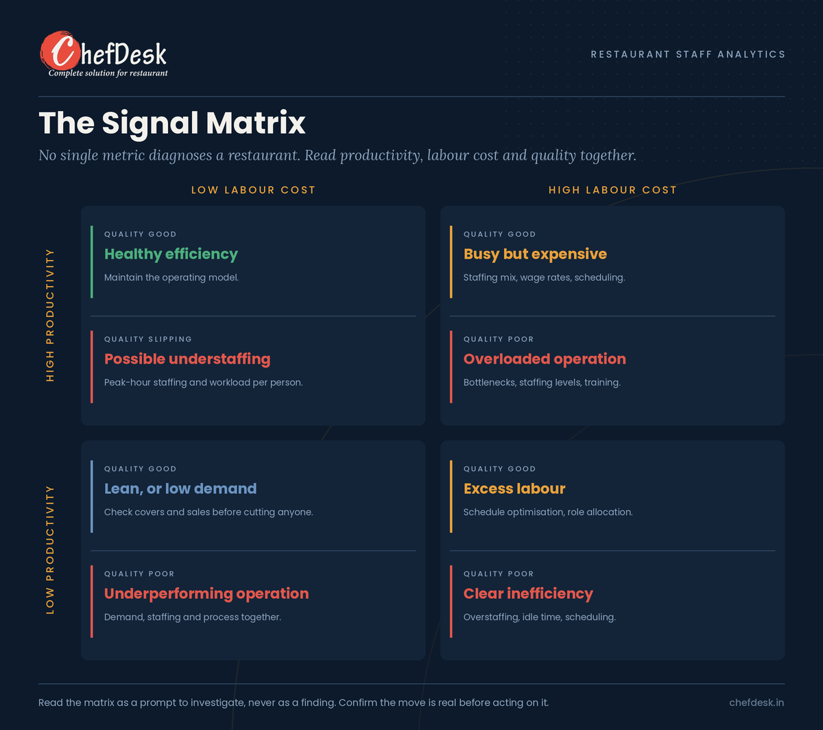
The quickest way to use these metrics is in combination.
| Productivity | Labour Cost | Quality / Service | Possible signal | What to investigate |
|---|---|---|---|---|
| High | Low | Good | Healthy efficiency | Maintain the operating model |
| High | Low | Deteriorating | Possible understaffing | Peak-hour staffing, workload |
| High | High | Good | Busy but expensive | Staffing mix, wage rates, scheduling |
| High | High | Poor | Overloaded operation | Bottlenecks, staffing, training |
| Low | High | Poor | Clear inefficiency | Overstaffing, idle time, scheduling |
| Low | Low | Good | Lean operation or low demand | Covers, sales, demand pattern |
| Low | Low | Poor | Underperforming operation | Demand, staffing and process |
| Low | High | Good | Excess labour | Schedule optimisation, role allocation |
Five signals worth knowing in detail
Signal 1: High productivity + low labour cost
The obvious reading is "our team is efficient." It may be right.
Before accepting it, check order accuracy, service time, complaints, overtime and guest wait time. If those are healthy, you have genuine efficiency. If they are deteriorating, you are not efficient — you are understaffed, and the saving is being paid for by your guests and your team.
**Are we efficient, or are we simply running lean?**
Signal 2: High productivity + high labour cost
Usually the answer is in average order value.
| Restaurant A | Restaurant B | |
|---|---|---|
| Orders/labour hour | 20 | 14 |
| Average order value | ₹350 | ₹700 |
| Sales/labour hour | ₹7,000 | ₹9,800 |
A is more active. B is more valuable. The problem may not be staffing at all — it may be low average check, weak upselling, heavy discounting or a low-value menu mix. That is a revenue productivity problem wearing a labour costume.
Signal 3: Low productivity + high labour cost
The clearest warning in the matrix. Likely causes: overstaffing, poor scheduling, too many staff in low-demand periods, idle time, weak forecasting.
Check demand before cutting anyone. A slow Tuesday afternoon is not a staffing failure.
Signal 4: Rising productivity + falling accuracy
Orders per labour hour up, service time down, accuracy down, remakes up, complaints up.
The classic speed-versus-quality warning. Causes include peak-hour overload, thin training, awkward POS workflow, poor FOH-kitchen communication, or a menu too complex for the kitchen's capacity.
The fix is not automatically more people. Often it is a better process — or a shorter menu.
Signal 5: Fast order-to-KOT + slow KOT-to-ready
Order → KOT = 30 seconds but KOT → Ready = 22 minutes
Front of house is working. The constraint is in the kitchen: understaffing, a single station bottleneck, equipment capacity, item complexity, or too many simultaneous KOTs.
This is where process metrics beat employee metrics, and where measuring the server harder would do actual harm.
When the metric lies
This is the section most KPI articles leave out, and the one that decides whether your dashboard is worth trusting.
Staff will optimise for what you measure
Where kitchens are measured on ticket times, predictable behaviours appear:
- Marking orders complete before the food is ready, making the kitchen look faster than it is
- Leaving completed orders on screen, inflating recorded times
- Letting orders accumulate and clearing them in a batch, destroying real-time visibility
The first is the dangerous one, because it tends to appear precisely in understaffed or very high-volume kitchens — exactly the situations your metrics exist to detect. The data improves while the operation deteriorates.
The same logic applies elsewhere. Measure servers purely on upsell rate and you get pushy service. Measure purely on turn time and you get guests hurried out. Measure accuracy without measuring voids and you get errors quietly voided rather than recorded.
Two defences: always pair a speed metric with a quality metric, and periodically check digital timestamps against what you see on the pass during a live service. If they disagree, trust the pass.
One week is not a trend
Consider this, which looks like a clear warning:
| Week | Orders/Labour Hour | Labour Cost % | Accuracy |
|---|---|---|---|
| Week 1 | 16.2 | 20.5% | 98.1% |
| Week 2 | 17.1 | 19.6% | 97.8% |
| Week 3 | 18.4 | 18.4% | 96.9% |
| Week 4 | 19.2 | 17.2% | 95.8% |
Productivity up, labour cost down, accuracy steadily falling. That reads as over-optimisation, and it may be.
But apply assumption 5. Our reference restaurant runs roughly 500 orders a week, so the move from 98.1% to 95.8% is about twelve orders. That is within reach of normal variation, a public holiday, one new hire, or one supplier substitution.
Four consecutive moves in the same direction is more persuasive than any single move. But a four-week run at this volume is still thin evidence. Look at the same four weeks last year, and at the same daypart rather than the whole week, before concluding anything.
The practical rule: treat a metric as a signal to investigate, never as a finding. The dashboard tells you where to look. It does not tell you what you will find.
The cost that never appears in your labour cost percentage
Staff turnover in Indian restaurants is high, and it shows up as recruitment, re-training, slower service while new staff learn, more errors and more supervisor time. Almost none of it appears in the labour cost percentage.
This creates a trap. A manager who cuts labour cost by running lean may be generating turnover that costs more than the saving, in a line item nobody tracks.
Worth adding to any efficiency review: monthly attrition by department, average tenure, absenteeism, overtime hours per employee, and the proportion of shifts worked by staff with under three months' tenure.
That last one is a genuinely useful leading indicator. A shift staffed mostly by recent joiners will show worse accuracy and slower service for reasons that have nothing to do with effort.
Do not compare employees without considering the role
Servers / captains: covers served, sales per labour hour, average check, items per cover, upsell rate, order accuracy, table turnaround, complaints.
Kitchen: KOTs per labour hour, items per labour hour, average preparation time, on-time KOT %, remake rate, waste, station productivity.
Cashiers: bills per hour, billing time, billing error rate, void and correction rate.
Managers: labour cost %, prime cost, overtime, schedule variance, sales per labour hour, service quality, departmental productivity.
A single "staff efficiency score" across all roles is misleading by construction.
Two fairness points. A server assigned to a low-volume section will show weak numbers through no fault of their own, so rotate sections before drawing conclusions. And a kitchen's numbers depend heavily on the menu mix that arrives on a given night.
Leading indicators versus lagging indicators
Leading — rising service time, rising overtime, rising workload per employee, growing KOT backlog, longer table waits, more order modifications, rising absenteeism, a falling share of experienced staff per shift.
Lagging — complaints, poor reviews, lost sales, high labour cost, turnover, refunds, remakes.
A good dashboard surfaces the leading ones before they become expensive.
From KPI dashboard to diagnostic dashboard
A traditional dashboard shows:
Orders/Labour Hour: **18.2** · Labour Cost: **17.6%** · Accuracy: **96.1%**
That is information.
A diagnostic dashboard says:
### ⚠️ Possible peak-hour overload Orders per labour hour rose **14%** over four weeks while labour cost fell **11%**. Over the same period, average service time increased, order accuracy declined and remakes rose. **Suggested investigation:** peak-hour staffing and kitchen capacity, Friday and Saturday 8–10pm.
That is a decision signal. The difference is that it states what moved, what moved with it, where, and what to look at.
A practical scorecard
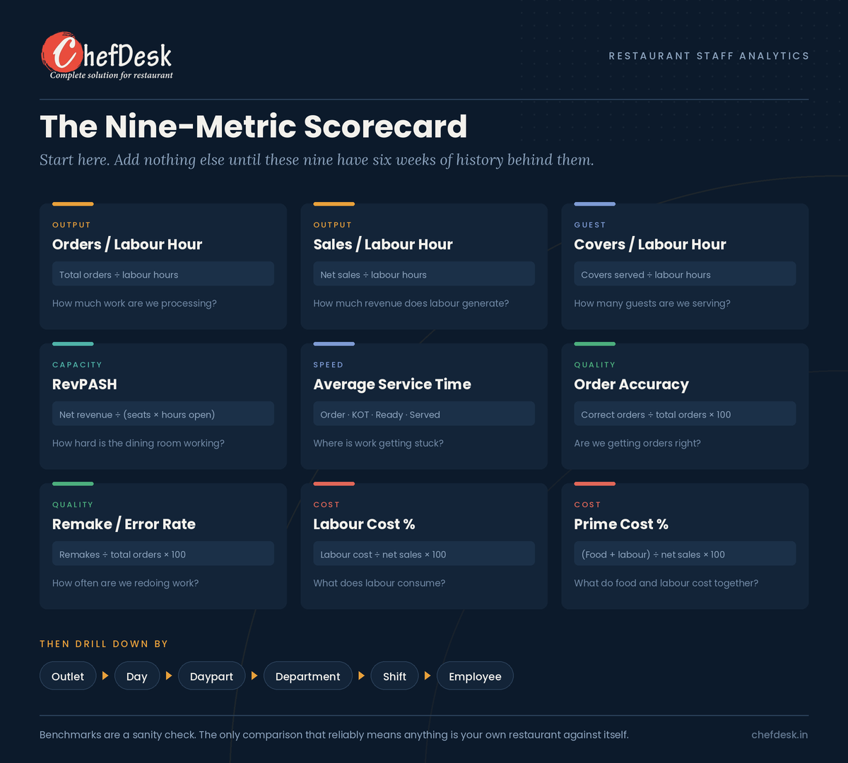
Start with nine measures:
| Dimension | KPI | What it answers |
|---|---|---|
| Output | Orders/Labour Hour | How much work are we processing? |
| Output | Sales/Labour Hour | How much revenue does labour generate? |
| Guest | Covers/Labour Hour | How many guests are we serving? |
| Capacity | RevPASH | How hard is the dining room working? |
| Speed | Average Service Time | How quickly are we serving? |
| Quality | Order Accuracy | Are we getting orders right? |
| Quality | Remake / Error Rate | How often are we redoing work? |
| Cost | Labour Cost % | What does labour consume? |
| Cost | Prime Cost % | What do labour and food consume together? |
If you measure nothing today, start here
Three weeks, in this order:
Week 1 — fix the denominator. Decide how you will count labour hours and what goes into labour cost. Write the definition down. This single step determines whether anything that follows is comparable.
Week 2 — measure three things only. Covers per labour hour, labour cost %, and order accuracy. One output, one cost, one quality. Record them daily, split into lunch and dinner. Nothing else.
Week 3 — add the service-time chain for one daypart. Your busiest service only. Order-to-KOT, KOT-to-ready, ready-to-serve. You are looking for which link is longest, not for a target.
Then run that set for six to eight weeks before judging anything. You are building a baseline, and you do not have one yet.
If your restaurant is not our reference restaurant
Most of this article holds regardless of format. These parts do not.
If you run QSR or a cloud kitchen. Covers per labour hour will be many times higher, and orders per labour hour becomes the more useful output measure. RevPASH is largely irrelevant with few or no seats. Labour cost percentage tends to run lower and food cost higher. The signal matrix still works unchanged.
If you run fine dining. Covers per labour hour will be far lower by design, because the service ratio is the product. Judging a fine-dining kitchen on productivity metrics will tell you to dismantle the thing guests are paying for. Weight quality and average check instead.
If your staff are genuinely hourly or on contract. Assumptions 1 and 2 relax. You can measure hours directly, and your labour cost is closer to payroll, though contractor margins and overtime still need including.
If you are much smaller. Below roughly 200 orders a week, weekly percentages are too noisy to act on. Use monthly periods, and watch absolute counts — three remakes, eleven wrong items — rather than rates.
If you run multiple outlets. Compare each outlet against its own history first, and only then against each other. Cross-outlet comparison is where the matrix gets misused most, because two outlets rarely share a daypart pattern, a menu mix or a local wage level.
The principle underneath all of it
The goal of staff analytics should not be:
"Find the employee who is working the least."
It should be:
"Find where the operation is losing time, money or quality, and understand why."
An employee may have low orders per hour because the kitchen is backed up. A kitchen may have high preparation time because one station is overloaded. A server may have low sales because they were assigned a low-volume section. A restaurant may have low labour cost because it is understaffed and about to lose three cooks.
The metric is the signal. The operational context is the diagnosis.
And one consequence worth stating plainly: if staff believe these numbers are being used to catch them out, you will get managed numbers rather than real ones. Measurement works best when the team understands it as a way of finding where the process is failing them.
A framework managers can remember
When a metric moves, ask four questions:
- What changed? Identify the KPI that moved.
- What moved with it? Check the related output, speed, quality and cost metrics.
- Where did it happen? Drill down by outlet, shift, daypart, department, employee.
- Is it real? Enough volume to be a signal? Could it have been gamed? Does the same period last year look similar?
Only then: what operational action should follow?
The objective is not to improve the number. It is to improve the operation.
What you need in place to actually capture this
Most of this article is useless without a way to collect the underlying data. There are three levels, and you probably need less than you think.
Level 1: a spreadsheet
The cost and output metrics need nothing more. Covers, orders, net sales, labour hours, labour cost, food cost, errors and remakes are all numbers a supervisor can record at the end of a shift in under two minutes. Everything in the output and cost sections of this article calculates from those eight inputs.
We have built a free tracker that does exactly this: a daily log, an automatic weekly roll-up, and a sheet that reads the signal matrix for you and tells you which cell you are in. It also reports how many orders sit behind each move, so you can judge whether a change is real before acting on it.
Where a spreadsheet stops working is the service-time chain. Nobody is going to stand with a stopwatch through 200 covers, and if they did, the act of watching would change what they measured. Speed metrics need to be captured automatically or not at all.
Level 2: a captain app and a kitchen display system
This is the part worth understanding, because it is the difference between guessing at your service times and knowing them.
Each step in the service chain leaves a timestamp, but only if something digital records it:
| Timestamp | Comes from | Lets you measure |
|---|---|---|
| Order placed at the table | Captain app on a handheld | — |
| KOT reaches the kitchen | POS / KOT routing | Order-to-KOT time |
| Item marked ready | KDS | KOT-to-ready time |
| Order served | KDS bump or captain app | Ready-to-serve time |
| Bill settled, table cleared | Billing | Table turnaround time |
Without a captain app, the first timestamp does not exist and you cannot separate front-of-house delay from kitchen delay. Without a KDS, the kitchen is a black box between KOT and plate. With both, the entire chain in the speed section of this article populates itself, per station, per daypart, with no one recording anything.
This is also what makes Signal 5 diagnosable. Knowing that order-to-KOT is 30 seconds while KOT-to-ready is 22 minutes requires two separate systems to have stamped two separate events. One combined "service time" number cannot tell you which half of your operation is the constraint.
The question to ask a software vendor
A captain app and a KDS integrated into billing are no longer unusual in the Indian market. Several established platforms offer them — Petpooja, Restroworks (formerly Posist), Rista, GoFrugal and others, alongside ChefDesk — sometimes bundled, sometimes as paid add-ons requiring extra hardware. Packaging varies more than capability does, so check what is included in the plan you are actually buying.
Plenty of systems display a live kitchen screen and report nothing afterwards. A KDS that shows the current queue but cannot tell you your average KOT-to-ready time by station last Saturday has solved an operational problem and left your measurement problem exactly where it was. Ask to see the report before you buy, not the demo screen.
(Disclosure: ChefDesk is our product. The point above holds whichever platform you choose, and we would rather you asked us that question than did not.)
A caution that applies to all three levels
Automatic timestamps are better than manual logs, but they are not immune to the behaviours described earlier in this article. A kitchen under pressure can still mark orders ready before the food is up. Automation improves the data's consistency, not its honesty. The pairing rule stands at every level: never read a speed metric without a quality metric beside it.
Conclusion
Staff efficiency cannot be measured with one number.
Orders per labour hour tells you how much activity the team handles. Sales per labour hour tells you what that activity is worth. RevPASH tells you how hard the room is working. Labour cost percentage tells you what it costs, and prime cost tells you whether that cost is quietly being moved into food. Service-time metrics tell you where the operation is slowing down. Accuracy tells you whether speed is being bought with quality.
The insight comes from connecting them.
A restaurant that raises orders per labour hour while holding accuracy and service quality has probably improved. A restaurant that raises orders per labour hour while accuracy falls, complaints rise and service slows has simply pushed its staff harder, and will find out what that costs when the cooks leave in November.
**Good staff analytics do not just tell you that performance changed. They tell you what the change is signalling, where to look, and whether to believe it.**
Every figure in this article derives from the reference restaurant and the seven assumptions set out at the start. They are a working model, not research findings, and they are stated so you can judge how far your own operation sits from them. Build your own baselines before acting on any number here.